May you have a wonderful Christmas time, joyful, peaceful and delightful!


It was the longest hiatus that started with our summer holidays and lasted, well, till now. It didn’t happen for any dramatic reason, we just didn’t have enough time or organizational skills to make the life/work/social media combo work so only one thing of those could be put on a break. However. We’re back. We will strive for regularity and even if we slip occasionally, we promise not to disappear for such inordinately long periods. Back to Christmas celebrations now, thanks for sticking by us!

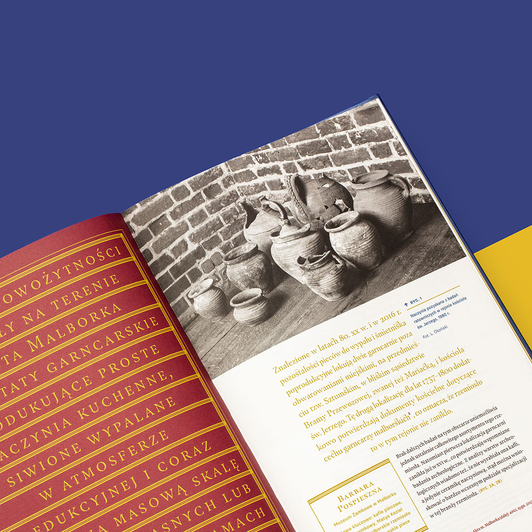
As the title says, we are very happy to announce that the book we recently shared with you, Regnum defendo designed for the Castle Museum of Malbork, received a Communication Arts Award for book design. We thank the jurors for recognizing our work and thanks to the client for letting us go a little wild with it.

It’s crazy how behind we are with sharing our current (and less-than-current) projects. We have some of them photographed, some even edited, and tons waiting to be photographed (anybody wants to intern with that? It’s super boring so probably not). But. This book absolutely needs to be shared because it’s one of our favorite projects from the last year. It is titled Regnum defendo ense et alis tego stricto and it is a second book in a series, after Sapientia aedificavit sibi domum that we designed before (you can see it here). It accompanied the second in a series of exhibitions on the history of the Malbork Castle – this one showing the history after the Teutonic Knights, when Malbork became a part of the kingdom of Poland.

The design of the book is at its core based on Sapientia… but the color scheme, elements of the typography and layout were updated to match the second exhibition. The strong typographic arrangements are inspired by books from the period and appear not only on the cover but also on the title pages and in the introductions of all the articles. The title on the cover is debossed in golden foil. The half dust-jacket with a crest – from a document whose motto was used to title the exhibition – unfolds to a double-sided poster. This books is less minimalistic than the first one (or, appropriately, more “baroque”) and as such was a different kind of challenge and fun to work on.

You can find a few more images on our website.

A while back we told you about the workshop we ran where people had a chance to create their own food lettering. Today we’re finally sharing some of the really cool results.
Disclaimer: because of the data protection (and because we don’t really have the names of all the authors) we’re not signing any of the designs. But if it’s yours and you want credit, please let us know!

Before it all started, some of the materials we prepared.
And as it was happening.

And finally, some of the works:

A super impressive, confident work with a smart use of the natural veggie curves.
A classic theme. And look at this ingenious heart.
This is by our youngest participant who designed his name.
And another name piece, this time by a slightly older author.
Just initials, but with a creative, varied use of apples.
The beginning of a cool leek alphabet.
This one impresses us a lot, we love the varied Os and the use of seeds. It means “calmness.”
This fun, rich work says “Your choice.”
There was definitely a common theme for some of the works. This is another example of confident decision-making.
Some people chose to do illustrations instead of letters, and how could we mind if the results are so awesome.

Thank you, everyone, for participating, it was more fun than we expected and the effects really impressed us. And for those of you who might worry, we salvaged what was salvagable (most of it ended up in a soup) and composted the rest. See you next time!

We are very happy to share with you the fact that Theodor Joseph Blell Inventory received awards in The Most Beautiful Polish Books competition. The book received an Honorary Mention and a Special Award for perfect typesetting. This book, which we described in detail here, was an exciting challenge and we are delighted to have it noticed, also in its more technical, less flashy aspect that nonetheless cost us a lot of time and ingenuity. (Those tables!)

Tomorrow we’re participating in a double event. It consists of a promotion of the book Fête funèbre or Art and Death, which is published by the Painting Department of the Academy of Fine Arts and which we designed. The book follows an exhibition catalog that we designed a few years ago and includes essays on the subject of how death influences art. (We will obviously show you the book once we have it.)

The other event is an opening of an exhibition titled Hamlet’s Prop: Skull in Visual Arts and among some great works there will be also our modest poster from the Iconic Painters series, on de La Tour.

We also had the pleasure of designing the poster for the event: it combines a plant motif used for the book cover with a skull invoked by the exhibition’s title. You can see a simplified version above (with way less text than in the printed version but the same illustration). If you’re in Gdańsk and in a slightly morbid mood, come join us!

This used to be a guessing game but we already told you the answer.

We had a busy Night of Museums last Saturday. One of the events we took part in was the opening of an exhibition at the Museum of Gdańsk whose graphic elements we designed. The exhibition, titled “In a City Mood,” shows paintings of pre-war Gdańsk, created by artists who often lost their Gdańsk home. The image of the city is idealized, nostalgic but despite that, perhaps surprisingly, familiar to anyone who knows the city.

The exibition is arranged quite charmingly in a new exhibition space in the Artus Court in a way that recalls old, cozy salons, with dark blue walls, golden frames for the paintings and actual furniture: chests of drawers to open and see etchings inside and armchairs for visitors to rest in. Our designs correspond with the coziness of the interior design: with slightly old-fashioned ornaments and decorative serif typography they add to the exhibition’s sentimental atmosphere.