
May this Easter time bring you joy and spring renewal.
(The card by our son. And we will post again other stuff than holiday cards. Promise!)

May this Easter time bring you joy and spring renewal.
(The card by our son. And we will post again other stuff than holiday cards. Promise!)

May this Christmas bring you everything you need to renew the light within you. Rest and be merry!

We invite you to visit our new exhibition that will take place in the Uphagen House in Gdańsk (Długa Street). We will be showing over 30 books we designed in recent years, accompanied by materials illustrating the details of book design: layouts, print choices etc.
The exhibition opens tomorrow, Dec. 8th, at 5 PM, entrance free. Hope to see you there!
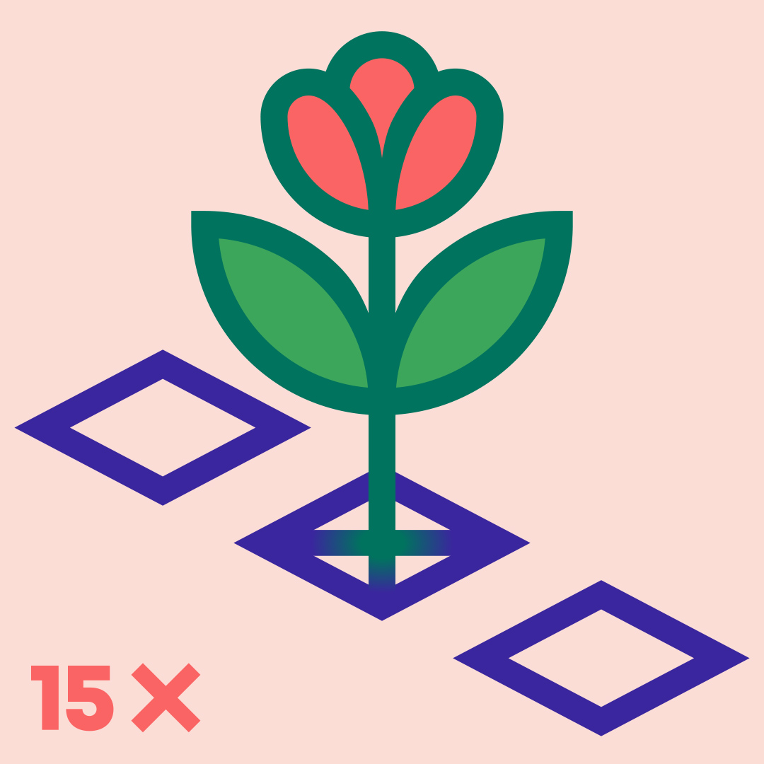
If you’re a Polish citizen, please vote on 15th. Let’s make the future green and flourishing!
(And if you’re not Polish, vote in your elections, don’t give up your power.)
It’s our 10th wedding anniversary today (yay) and our kids drew us cards that we wanted to share with you.
A meadow by our older son.

And by our younger son an activity card! Can you find all 10 tens in the drawing?:)


I am absolutely thrilled to tell you that I have the honor of joining the Communication Arts jury panel for 2023 Design Competition!
Back when I was in high school (it was very much not an art school) my arts teacher had some CA annuals and they seemed to come from a different world (I didn’t even know what a job of a graphic designer meant), an utterly fascinating world that I felt drawn to. I was so excited when we realized we could participate in the CA competition and as a result we won our own Awards of Excellence. But never ever did the 18-year-old me (or, you know, older me) think I would be asked to judge other people’s entries. I am really looking forward to seeing all the amazing work submitted this year!

Once again we got the absolute pleasure of designing a book in the series of catalogs for the Castle Museum of Malbork, the fifth one. This one consists of essays about the 19th-century attempts to restore the then-ruined castle to its former glory, inspired by Romantic fascination with the past.

Once again the color palette was inspired by the exhibition that preceded the book and we quite enjoyed working with this range of browns and golds (not our typical palette). While the layout and general typographic choices continue the line established in the previous publications, this one includes some nods to the 19th-century aesthetics and design. The pattern is derived from original historical illustrations. One of the most fun parts to design proved again the half dust-jacket. This time the outside is decorated with a pattern also designed from bits of historical drawings, resembling maybe a fancy gift paper?, and once you undfold it, it becomes an exhibition poster. We used an extra spot color, the lovely metallic beige, both inside the book and on the dust jacket, and a different spot color for the poster. The title is hotstamped with golden foil.


The previous books in the series can be seen here and here (we’ve yet to photograph the parts of the series with the exhibited works of art…). And here’s the book’s official description on our website with some more photos.

Our exhibition in the Academy of Fine Arts in Gdańsk is open for a few more days (until Thursday) if you feel like dropping by. Otherwise, please enjoy a few photos that we took.

The gallery space is cozy, with a few charming details, including an old doorway. We chose a simple, minimalistic arrangement based on black and white, with coral-red accents. Since most of the book designs include patterns or ornaments we used those to design symbols so that each book is represented by one. We replaced most captions with those symbols, referring the viewer to the boards on the wall so that they can participate in a small riddle. (They don’t have to, of course, because it’s not hard to figure out which board goes with which book anyway.) From the boards they can learn details about the book they’re looking at: its client, technical specs, grid.


