Archive

Tag Archives: typography

help-hot-16-redesign

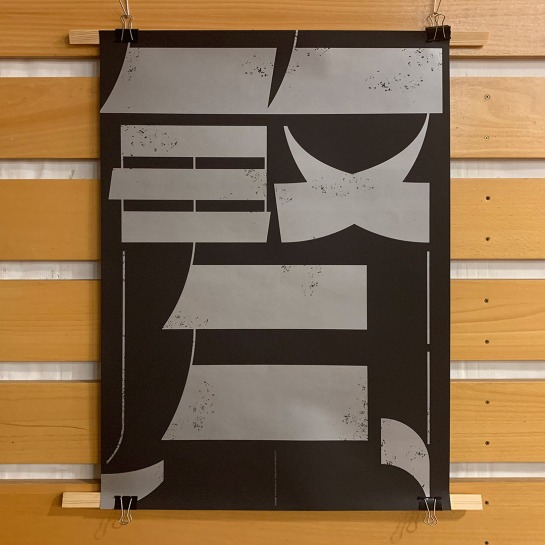
We participated in the social media action raising money for charity that supports Polish health service during the pandemic. This is originally a rap challenge but trust me, you wouldn’t like to hear us rapping. Luckily, it also has a design version whose only requirements are to create artwork with “help” and “16” in it. Here’s the link for the charity if you want to support it.

200517-redesign_studio-instagramAlso, if we’re on the topic, we forgot to mention that we have an Instagram account so make sure to come by and say hi (if social media is your thing, anyway). We put some unique stuff there every now and then, together with occasional pictures of what’s going on with us. Here’s the link.


Stay healthy, stay generous, see you next week!

redesign-studio-miasta_skoszarowane-book-03

The book Miasta skoszarowane (Cities as Military Barracks) by Jan Daniluk was published by the Museum of Gdańsk. This doctoral thesis describes the life in the cities of Gdańsk and Sopot during the Second World War when the German army stationed there and how this affected people’s life. A large part of the book focuses on the daily life under those difficult circumstances.

redesign-studio-miasta_skoszarowane-book-05

Because of the subject matter we chose a strong visual language with some disconcerting elements. Everything is printed in black and vivid red, some elements are framed with thick broken frames symbolizing the oppresion of the period and many typographic elements are broken. We are grateful to the author (and quite impressed by him!) for his openness and trust in our ideas which led to an unusual historic book (and, of course, to the publisher for agreeing to all of this).

The cover with an archival photo. The broken frame is printed with black foil.

redesign-studio-miasta_skoszarowane-book-01redesign-studio-miasta_skoszarowane-book-06

The beginning of chapter three: a title spread and first pages.

redesign-studio-miasta_skoszarowane-book-08redesign-studio-miasta_skoszarowane-book-14redesign-studio-miasta_skoszarowane-book-18redesign-studio-miasta_skoszarowane-book-12redesign-studio-miasta_skoszarowane-book-20

200203-redesign-sapientia_poster

We spent the last week photographing some of the recent(ish) work because we’ve got a crazy backlog of unphotographed designs (we’re really bad at keeping up with this stuff…). Now we’re finishing editing some of those photos and we’ll be showing them to you in the coming weeks (and also adding them to the website, finally).

Today enjoy this sneak peek of a project we did for the Castle Museum in Malbork. It is a double-sided exhibition poster which, after folding, works as a dust jacket for the book published for the occasion. (If it’s not clear, it will become so once we show you the book itself.) The title in Latin means “Wisdom built a house for itself” as the exhibition showed the history of the Teutonic Order in its headquarters: Malbork. The poster is printed in silver and black. The exhibition identity and logo (the cool gothic S) by Maciej Bychowski.

tdc-pjatk-1

Sorry for the short hiatus but we’ve had a few deadlines and we took a super short vacation: we spent a weekend in Warsaw. While there, we visited the Type Directors Club exhibition in the Polish-Japanese Academy. The show was really small (it’s held in a lecture room) but we found a few interesting typographic designs that we wanted to share.

Below: Menil Collection Identity by Kristen Chon.

Menil-Collection-Identity-by-Kristen-Chon

Menil-Collection-Identity-by-Kristen-Chon2

Complexity and Simplicity by HDU23 from Mainland China. This was lavishly printed with silver on black, which the photo doesn’t show but which really made the poster (this and the strong, clear composition).

Complexity and Simplicity HDU23 Mainland China2

Complexity and Simplicity HDU23 Mainland China

Complexity-and-Simplicity-HDU23-Mainland-China3

Pango by Osborne Shiwan. We always like the combination of type and stylish sports photography.

Pango-by-Osborne-Shiwan

Julliard School identity (fictional) by Karlo Fuertes Francisco. Type that (almost) sounds.

julliard-school-by-Karlo-Fuertes-Francisco

This poster by Srishti Jain from Savannah College of Art and Design immediately drew attention.

Srishti-Jain-from-Sohee-Kwan-at-Savannah-College-of-Art-and-Design

And finally some strong-as-always type posters by Paula Scher for Shakespeare in the Park. This only seems to get better with time.

Paula-Scher-Shakespeare-in-the-Park-Pentagram

If you in the area, drop by the exhibition and see for yourselves; it’s a short but interesting stop.

redesign-castle-book-inst1

A few months ago we finished a book  for the Malbork Castle Museum.

The Malbork Castle is a world-famous heritage place, a 13th century castle built by the Teutonic Order (Malbork was then called Marienburg if that tells you more). It is a truly impressive historic monument well-worth visiting. The book is a scientific study of life in the castle at the time when the Teutonic Order lived there. It talks not only of politics and economy but also of minutiae of everyday functioning of this huge establishment.

The book’s design had to be sober not to distract from the academic content. Mainly, we had to make the information aesthetic and legible. We chose to use a golden-brown spot color for all the special texts in the book and for archival photographs which are printed in gold and black. The cover contains a golden-brown photo of the castle and the title is hotstamped in silver.

redesign-castle-book-inst2redesign-castle-book-inst3

We will share more photos of the book later but for now they’re not properly edited so check back soon.

redesign-woodstock50-inst1

50 years ago in Woodstock a legendary music festival took place and some of the most exciting artists of the time performed. We always loved the music of the time and the very myth of Woodstock, with its celebration of love and peace and rock’n’roll, and we’re celebrating the anniversary with a poster.

redesign-woodstock50-inst2

redesign-pixies-doolittle-gouge-gun-03

(First of all, this post is so late – sorry about that. Our son is back to preschool and this means back to the onslaught of all sorts of cold viruses like you wouldn’t believe. But we’re powering through.)

A long time ago we started Project Doolittle: both a tribute to the Pixies’ great album and an experiment in tangible type. By the time we finished the project, that is designed all 15 covers for all the songs, it is (already a bit past) the 30th anniversary of the release of Doolittle so the project becomes even more of a celebration of this record.

redesign-pixies-doolittle-all

Each cover is a different attempt at tangible typography: letters made of various materials, crafted by hand, sometimes designed by us and sometimes based on existing typefaces. We didn’t mainly focus on the connection between the material and the song, going more for an impressionistic, poetic if you will, relation between them (though in some cases the connection is more obvious than in others). We wanted to experiment with 3D typography to see how much using actual, physical objects rather than a computer adds to typographic designs.

This project started as one of our very first forays into handmade type and in the period between its beginning and ending we managed to do quite a few such projects (including a PhD thesis) but we are happy that we chose to return to this series and finished it because it’s one of those string-free projects that are very fun to work at. Hope you enjoy it as well.

redesign-pixies-doolittle-wave-hey-04redesign-pixies-doolittle-hey-25redesign-pixies-doolittle-monkey-herecomes-05redesign-pixies-doolittle-herecomes-01redesign-pixies-doolittle-monkey-08redesign-pixies-doolittle-wave-19redesign-pixies-doolittle-mygun-28redesign-pixies-doolittle-mygun-27redesign-pixies-doolittle-mygun-26redesign-pixies-doolittle-mrgrieves-23redesign-pixies-doolittle-mrgrieves-02redesign-pixies-doolittle-mrgrieves-22redesign-pixies-doolittle-gouge-14redesign-pixies-doolittle-gouge-13redesign-pixies-doolittle-silver-16redesign-pixies-doolittle-silver-15redesign-pixies-doolittle-no13-10redesign-pixies-doolittle-no13-09redesign-pixies-doolittle-tame-18redesign-pixies-doolittle-tame-17redesign-pixies-doolittle-ibleed-11redesign-pixies-doolittle-ibleed-12redesign-pixies-doolittle-crackity-29redesign-pixies-doolittle-crackity-30redesign-pixies-doolittle-dead-07redesign-pixies-doolittle-dead-06redesign-pixies-doolittle-debaser-21redesign-pixies-doolittle-debaser-24